


Beginner Level
JavaScript and CSS - Fully Responsive Mobile Ready Website
-Learners already enrolled
 Avg. Hours
 Contains Video
 CPD Accredited
 Certify Now

Certify Now
Confident you have the skills to certify without completing the course content?
JavaScript and CSS - Fully Responsive Mobile Ready Website
Level-up your coding skills and create a responsive mobile website using JavaScript and CSS in this free online course.
More and more of the world’s web traffic is coming from mobile devices and organizations need to ensure that all their applications and websites are mobile-friendly. This free online web development course ...More and more of the world’s web traffic is coming from mobile devices and organizations need to ensure that all their applications and websites are mobile-friendly. This free online web development course will teach you the skills, techniques and methods required to set up and build a fully responsive and dynamic mobile website including webpage content and a working navbar using the popular JavaScript and CSS coding languages.
COURSE PUBLISHER-

Start Course Now
Certify Now Certify Now
Confident you have the skills to certify without completing the course content?

 Total XP:
 Confident you have the skills to certify without completing the course content?
What You Will Learn In This Free Course
- -
- -
- -
- -
 Knowledge & Skills You Will Learn

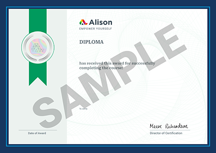
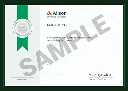
Complete This CPD Accredited Course & Get Your Certificate!
![]()
Certify Your Skills
A CPD accredited Alison Diploma/Certificate certifies the skills you’ve learned![]()
Stand Out From The Crowd
Add your Alison Certification to your resumé and stay ahead of the competition![]()
Advance in Your Career
Share your Alison Certification with potential employers to show off your skills and capabilities


Learner Reviews & Feedback
JavaScript and CSS - Fully Responsive Mobile Ready Website
View More Reviews
Back to top
Back to course information
Want to create a customised learning path for your team?

Our dedicated Learning Advisors are here to help you curate a customised learning path tailored to your organisation's needs and goals.
Not sure where to begin?

Discover the career most suitable for you and get started in the field with a step-by-step plan.
Get your Plan


